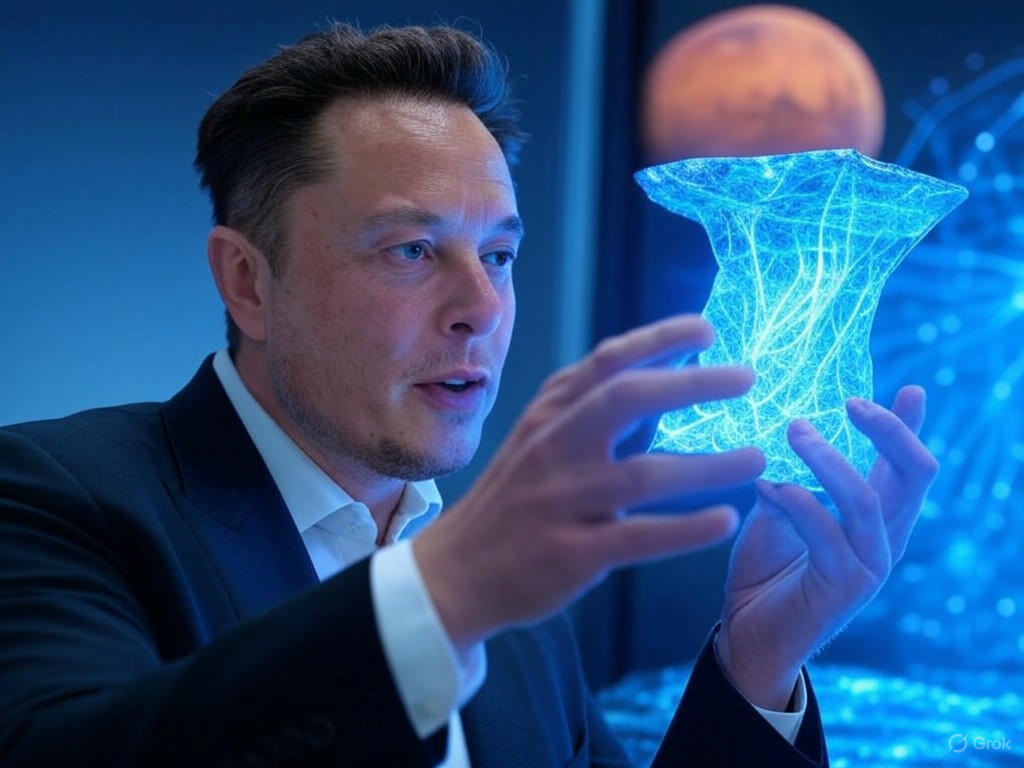
Summary for Grok 2 Image 📊
Grok 2 Image currently ranks 24th out of 24 models on the overall leaderboard with an aggregate score of 6.17. While it is capable of producing stunning, high-fidelity images in specific niches, it suffers from a severe stylistic stubbornness that drags down its overall utility.
Key Takeaways:
- Photorealism is King: The model leans heavily—almost exclusively—into 3D rendering and photorealism. It outright rejects prompts asking for 2D, isometric, or hand-drawn aesthetics.
- The "AI Sheen": Even in its strong photorealism categories, subjects often suffer from overly smooth, waxy skin textures that break immersion.
- Coin-Toss Anatomy: Hand generation ranges from utterly flawless to horrifyingly mangled, with little consistency between prompts.
- Bottom Line: Grok 2 Image is a solid tool for rendering modern architectural spaces or high-definition products, but it completely falls apart if you need stylized illustrations, retro graphics, or specific 2D art forms.
General Analysis & Useful Insights 🔍
Our deep dive into Grok 2 Image reveals a model with distinct, polarizing behaviors. Here is a breakdown of its core patterns, strengths, and failure modes.
The Photorealistic & 3D Bias 📸
Grok 2 Image has a massive bias toward 3D rendering and photorealism. This is a double-edged sword.
The "AI Sheen" and Anatomy Roulette 🖐️
While the model can produce a breathtaking Tattooed Portrait scoring a perfect 10/10, its default state for human faces often includes a waxy, plastic "AI sheen." Furthermore, human anatomy is highly unpredictable:
Prompt Adherence Limitations 📉
The model struggles with negative constraints and counter-intuitive prompts. For example, when asked for a subverted astronaut scene (an astronaut being ridden by a horse), the model reverted to its training bias and produced an astronaut riding a horse. It also failed the explicit color constraints in the Heterochromia portrait.
Text Generation 🔤
Grok 2 Image is surprisingly competent at generating text, successfully rendering complex signs like AGI has arrived and Birthday Cake text. However, it occasionally stumbles on exact spelling or punctuation when integrated into complex scenes.
Best Model Analysis by Use Case 🎯
Understanding where Grok 2 Image excels and where it fails is crucial for getting the most out of it. Compared to top-tier models like Nano Banana Pro, Grok 2 Image has a very narrow band of optimal use cases.
Where it Shines ✨
- Architecture & Interiors: This is arguably the model's best category. It excels at lighting, material textures, and spatial coherence. It is highly recommended for interior design mockups, like the Roman Bathhouse.
- Simple Text Rendering: If you need a photorealistic sign, billboard, or digital clock, Grok 2 Image can handle it reliably. The Digital Clock is a flawless example.
- Single-Subject Photorealism: When focused on a single face or object without complex stylistic constraints, it can produce hyper-realistic results.
Where it Struggles 🛑
- Ghibli style & 2D Animation: Avoid this model entirely for anime or traditional animation styles. It scored an abysmal 4.6 in the Ghibli category because it repeatedly turned 2D prompts into 3D plastic toys or Photorealistic CGI.
- Strict Graphic Design: Because of its 3D bias, it fails at Graphic Design tasks that require flat vectors, isometric projections, or minimal 2D shading.
- Complex, Crowded Scenes: Grok 2 Image struggles to maintain realism when too many subjects are introduced. Complex Scenes like a Bustling Market often result in uncanny, waxy faces in the background.
